Most people collect far more health information than they realize. A fitness app counts daily steps, a smartwatch estimates sleep, a notebook contains workout records, and a calendar quietly reflects busy or stressful weeks. Yet despite having access to all this information, many people still struggle to answer simple questions like, “Why did I feel more energetic this week?” or “What changed compared with last month?”
The problem usually isn’t a lack of data—it’s a lack of organization. When health information is scattered across different apps, notebooks, and memories, it’s difficult to recognize the patterns that matter. Individual numbers may seem important on their own, but without looking at them together, they rarely provide a clear picture of how your daily habits are influencing your overall well-being.
This is where a personal health dashboard can become useful. Unlike complicated health-tracking systems designed for professionals, a personal dashboard is simply a weekly summary of the habits and observations that matter most to you. Its purpose isn’t to measure everything possible. Instead, it helps you gather a few meaningful observations in one place so that reviewing your progress becomes easier and more practical.
More Information Doesn’t Always Lead to Better Decisions
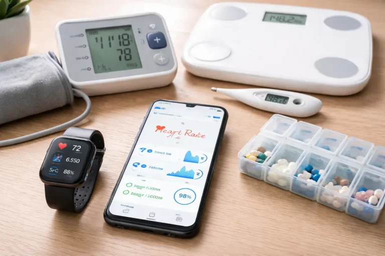
Modern technology makes tracking almost effortless. Phones monitor activity, wearable devices estimate movement and sleep, and countless apps promise deeper insights into every part of daily life. While these tools can be helpful, it’s surprisingly easy to become overwhelmed by the amount of information they produce.
Imagine opening five different apps just to understand how your week went. One shows exercise, another tracks meals, another measures sleep, while a notebook contains personal reflections. Each source tells part of the story, but none of them provides a complete overview. Instead of helping you understand your lifestyle, the information becomes fragmented and difficult to interpret.
A personal dashboard solves this problem by simplifying what you review. Rather than collecting every available statistic, you choose only the observations that genuinely help you understand how your week unfolded. This keeps the dashboard useful instead of turning it into another task that feels difficult to maintain.
Think in Weeks Instead of Individual Days
One unusual day rarely tells the whole story. A poor night’s sleep after traveling, an afternoon with low energy because of an unusually busy schedule, or skipping a workout due to unexpected responsibilities doesn’t necessarily indicate a lasting pattern. Looking too closely at single days can sometimes create unnecessary concern.
Weekly reviews provide a broader perspective. When you step back and examine several days together, temporary events become easier to separate from recurring habits. You may notice that your sleep was generally consistent except for one late evening, or that your activity level gradually increased compared with previous weeks. These broader trends are often much more valuable than isolated daily measurements.
Reviewing the week also reduces the pressure to perform perfectly every day. Instead of judging yourself based on yesterday alone, you begin evaluating your overall direction. This shift encourages steady improvement rather than chasing flawless daily results that are rarely realistic.
Build Your Dashboard Around Questions, Not Numbers
One of the biggest mistakes people make when creating health trackers is focusing almost entirely on numbers. While numbers can certainly be useful, they only become meaningful when they help answer practical questions about your daily life.
For example, instead of asking whether you reached a specific step count, you might ask whether you stayed active enough to support your usual routine. Rather than concentrating only on how many hours you slept, consider whether you generally woke up feeling rested throughout the week. These questions encourage reflection instead of simply collecting statistics.
Thinking this way also makes your dashboard more personal. Two people may record similar information but use it for entirely different purposes. Someone working on consistent exercise habits may pay closer attention to movement, while another person recovering from a demanding work schedule might focus more on sleep quality and energy. The dashboard becomes flexible because it reflects your own priorities instead of following a standard template.
Four Areas That Create a Balanced Weekly Dashboard
A useful dashboard doesn’t need dozens of categories. In many cases, four well-chosen areas provide a balanced overview of everyday health without becoming difficult to review.
Recovery
Recovery is about understanding how well your body and mind are recovering from the demands of everyday life. Instead of examining every detail, consider broader observations such as whether your sleep schedule remained fairly consistent, whether you generally woke up refreshed, and whether you felt physically or mentally recovered during the week.
Looking at recovery over several days often provides more meaningful insight than judging one restless night. It helps you notice whether your overall routine is supporting consistent rest rather than focusing on isolated interruptions that happen naturally from time to time.
Movement
Movement is another category that benefits from weekly review rather than daily perfection. Instead of counting every minute of activity, think about whether your week included enough regular movement to support your goals. Home workouts, walking, stretching, and staying active throughout the day all contribute to this broader picture.
Reviewing movement this way shifts attention away from individual workouts and toward long-term consistency. A dashboard should help you recognize whether activity has become a regular part of your lifestyle rather than highlighting only your busiest exercise day.
Nutrition
Instead of recording every calorie or ingredient, use this section to summarize how balanced your eating habits felt throughout the week. Consider whether meals were generally varied, whether you stayed hydrated, and whether busy schedules frequently influenced your food choices.
This broader approach keeps nutrition practical. Rather than creating another detailed food log, the dashboard encourages reflection on habits that are realistic to maintain and easy to review during future weekly summaries.
Daily Well-Being Completes the Bigger Picture
The final section of your dashboard brings together the observations that are often the hardest to measure but the easiest to notice. Energy levels, ability to concentrate, overall mood, and everyday stress don’t always fit neatly into numbers, yet they influence nearly every part of daily life.
Rather than trying to rate every emotion, keep this section simple. At the end of each week, ask yourself a few practical questions. Did you generally feel focused during work? Did stress remain manageable most days? Were there long periods of mental fatigue, or did you feel more balanced than usual? Short answers often provide more useful insight than detailed scoring systems.
Reviewing these observations alongside your recovery, movement, and nutrition categories helps you see how different parts of your lifestyle interact. You may discover that weeks with more consistent sleep also include better concentration, or that staying active makes demanding workdays feel easier to manage. These connections are often more valuable than any single measurement.
Your Dashboard Should Help You Make Better Decisions
A dashboard isn’t meant to become another collection of charts that you rarely look at. Its real purpose is to help you decide what deserves your attention during the coming week. Every review should leave you with a clearer understanding of what worked well and what could be improved without making unnecessary changes.
Instead of asking whether every goal was achieved, consider questions that encourage reflection. Which habit felt easiest to maintain this week? What seemed to require the most effort? Was there one change that noticeably improved your energy or productivity? Did a busy schedule affect several healthy habits at once?
These questions turn your dashboard into a practical decision-making tool. Rather than reacting to isolated events, you begin identifying the small adjustments that are most likely to improve your routine over time.
An Example of a Simple Weekly Health Dashboard
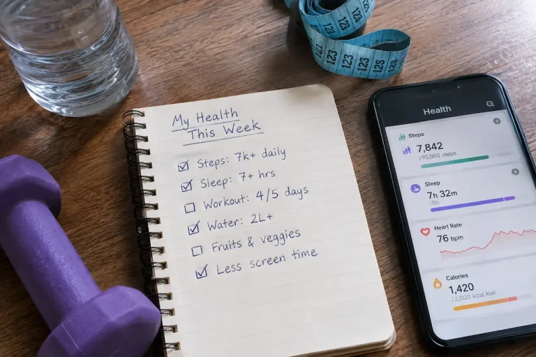
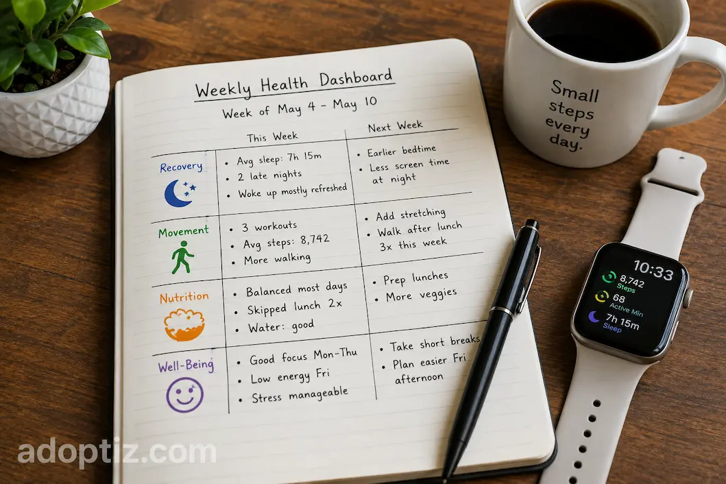
The dashboard doesn’t need complicated software or colourful graphs. A notebook, spreadsheet, or digital note can be enough if it helps you review the week clearly.
| Weekly Area | Observation | Next Week’s Focus |
|---|---|---|
| Recovery | Bedtime stayed fairly consistent except for two late nights. | Finish work earlier on evenings before busy mornings. |
| Movement | Three home workouts completed and more walking than last week. | Add one short stretching session after work. |
| Nutrition | Most meals were balanced, but lunch was skipped twice. | Prepare simple lunches in advance on busy days. |
| Daily Well-Being | Good concentration early in the week, lower energy by Friday. | Schedule short breaks during demanding afternoons. |
Notice that this dashboard isn’t filled with complicated numbers. Instead, it summarizes the week and points toward one realistic improvement for the following one. That makes reviewing your progress both quicker and more meaningful.
Avoid Turning the Dashboard Into a Scorecard
One of the easiest mistakes to make is treating every category as a test that must receive a perfect score. Once that happens, the dashboard stops being a helpful guide and starts feeling like another source of pressure. Missing a few workouts or having a stressful week can suddenly seem like failure instead of normal life.
A healthier approach is to treat each weekly review as information rather than judgment. If movement was lower than usual, ask what made the week different. If sleep became inconsistent, look for possible reasons instead of immediately setting stricter goals. Curiosity often leads to better long-term decisions than self-criticism.
Remember that your dashboard exists to reflect reality, not an ideal version of it. Honest observations—even during difficult weeks—are usually much more valuable than trying to make every category appear perfect.
Review the Dashboard Before You Plan the Next Week
Many people create trackers but rarely return to them. A dashboard becomes far more valuable when reviewing it becomes part of your weekly routine. Spending just a few minutes looking over the previous week’s observations can help you plan the next one with greater confidence.
You may notice that one habit has become consistent enough that it no longer needs special attention. At the same time, another area might benefit from a small adjustment rather than a complete overhaul. This gradual approach prevents the cycle of constantly abandoning routines and starting over from scratch.
Over time, each weekly review becomes part of a much larger story. Instead of seeing isolated successes and setbacks, you begin recognizing the overall direction of your lifestyle. That long-term perspective often makes healthy habits feel more achievable because progress is measured across months instead of individual days.
Frequently Asked Questions
Do I need a smartwatch or health app to create a dashboard?
No. A personal health dashboard can be created with a notebook, spreadsheet, or simple digital document. The goal is to organize meaningful weekly observations, not to collect as much data as possible.
How many metrics should I include?
Start with only a few categories that genuinely help you understand your routine. Adding too many measurements often makes the dashboard harder to review and less useful over time.
How often should I review my dashboard?
A weekly review works well for many people because it provides enough information to identify patterns without becoming overwhelming. Monthly reviews can also be useful for noticing longer-term trends.
Conclusion
A personal health dashboard is most effective when it helps you understand your week rather than simply record it. By bringing together a few meaningful observations about recovery, movement, nutrition, and daily well-being, you create a clearer picture of how your everyday habits influence the way you feel.
The strength of this approach lies in its simplicity. You don’t need dozens of charts, endless statistics, or expensive technology to gain useful insights. A small collection of thoughtful weekly observations is often enough to reveal patterns that would otherwise go unnoticed. Over time, those patterns help you make more informed decisions, build sustainable habits, and focus your attention on the changes that truly make a difference in everyday life.